Is this BAR CHART any good?

Post your Task 1 or 2 response and/or read the responses of other students and provide feedback.
Post Reply
dashis
Posts: 24
Joined: Sun Apr 20, 2014 3:22 pm

Is this BAR CHART any good?

Post by dashis »

The bar chart below gives information about the number of students studying Computer Science at a UK university between 2010 and 2012.

Summarise the information by selecting and reporting the main features, and make comparisons where relevant.
Image
-------------------
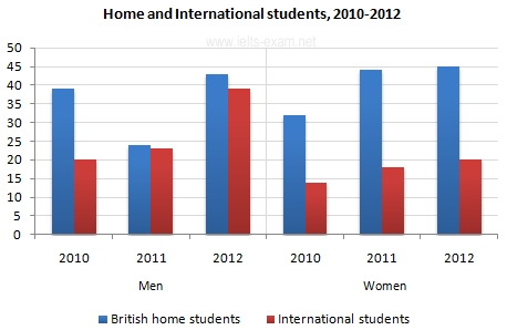
The bar chart compares the number of male and female students, studying Computer Science in a UK university from 2010 to 2012. It also indicates whether they were British or international students. As an overall trend it is clear that among both genders there was a majority of British students throughout the whole period.

Firstly, in 2010 the number of male students comprised of around 39 British and 20 international students, whereas in the female group this number consisted of 32 home and 14 international students.

Secondly, in 2011 the difference in the numbers of British and international students became even more noticeable among female students, with 44 British students compared to 18 international. However, among male students the difference got shortened with only 24 of the 47 students being British.

Lastly, in 2012 the trend remained similar to 2011, however the amount of students increased. For instance out of 82 male students 38 were international, while for female students only 20 out of 65 were non-British.

In conclusion, throughout the period the disparity of British and International students, was better visible among female students, however the amount of international students had risen in both genders.
User avatar
Flick
Grammar Checker
Grammar Checker
Posts: 1466
Joined: Mon Apr 21, 2014 10:06 pm

Re: Is this BAR CHART any good?

Post by Flick »

dashis wrote:The bar chart below gives information about the number of students studying Computer Science at a UK university between 2010 and 2012.

Summarise the information by selecting and reporting the main features, and make comparisons where relevant.
Image
-------------------
The bar chart compares the number of male and female students studying Computer Science in a UK university from 2010 to 2012. (<-- good start. Clear description, easy to understand.) It also indicates whether they were British or international students. As an overall trend, it is clear that, among both genders, the majority of students were British throughout the whole period.

In 2010 the number of male students comprised of around 39 British and 20 international students, whereas in the female group this number consisted of 32 British and 14 international students.

In 2011 the difference in the numbers of British and international students became even more noticeable among female students, with 44 British students compared to 18 international. However, among male students the difference decreased with only 24 of the 47 students being British.

In 2012 the trend remained similar to 2011. However, the total number of students increased. For instance, out of 82 male students 38 were international, while for female students only 20 out of 65 were non-British.

In conclusion, between 2010 an d2012, the disparity of British and International students was more pronounced among female students, however the amount of international students did increase in both genders.
Post Reply